

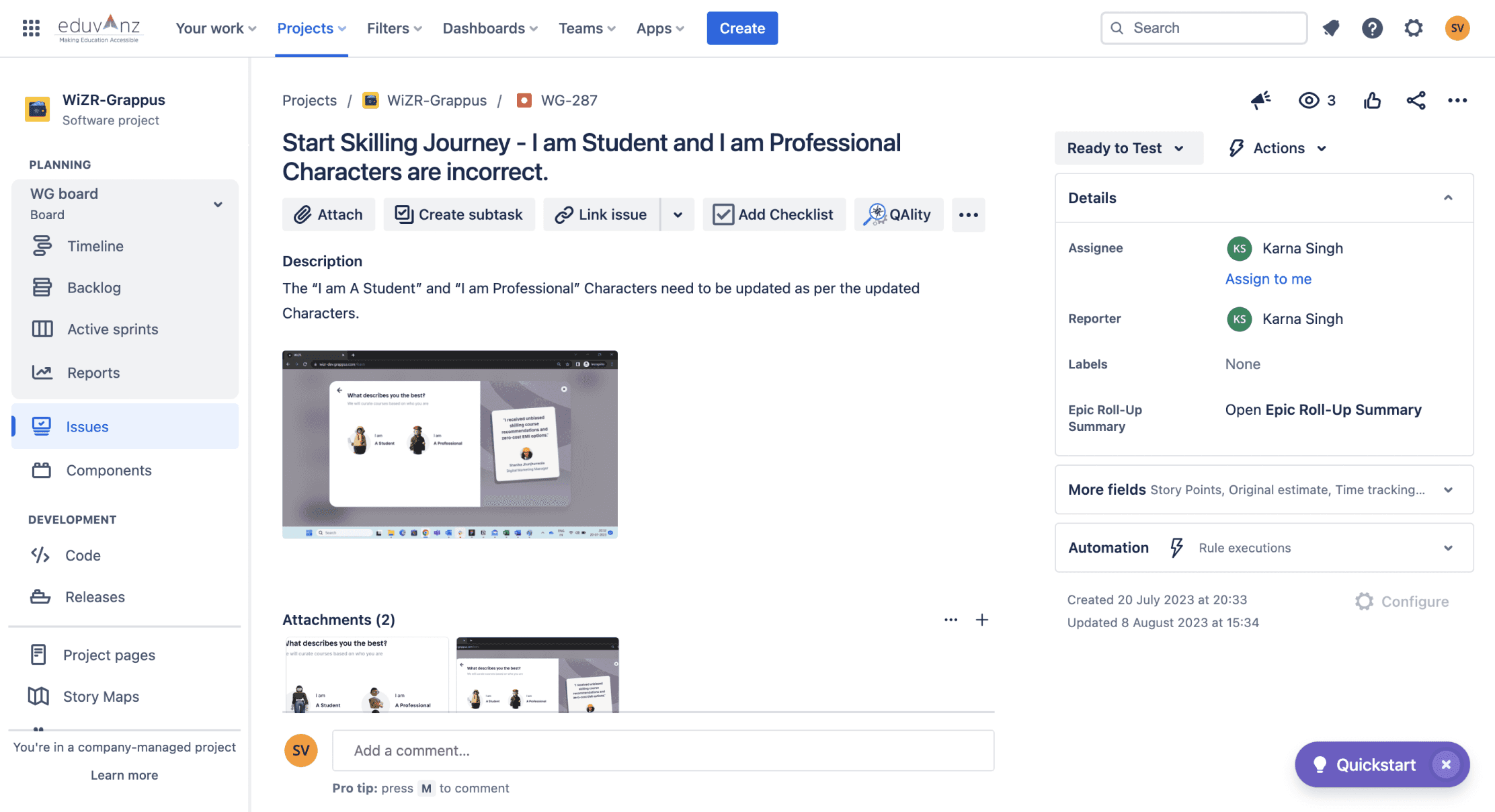
National Skill Development Corporation
An all-in-one skilling marketplace helping users find, compare, and finance courses tailored to their career goals.
client name
Wizr
timeline
Oct’23-Apr’24
my role
UX Design (user flow, mapping, wireframes)
UI Design
Client handling
the team with me
Arjun, Mrinalini, Prashant
scope
Responsive web
reading time
10-12 minutes
The project took 14 months to start with an idea to a product we could test.
Here is a TL;DR version if you’re short on time :)
The Gap
Upkilling platforms in India are overwhelming and transactional, lacking clear guidance, course relevance, and accessible financing, making upskilling confusing and costly
What did Wizr do?
Wizr personalizes upskilling by guiding users from career discovery to skill assessment, tailored course recommendations, progress tracking, and easy financing—making learning clear and stress-free.
How did Wizr do it?
Interactive Career Discovery & Skill Assessment
Gamified, cognitive science-based assessments that identify strengths, weaknesses, and career fit.
Personalized Course Recommendations
Personalized & strength-based course suggestions with learning paths & comparison tools.
Skill Benchmarking & Progress Tracking
Fit scores, peer comparisons, and clear insights into learning progress & career readiness.
No-Cost EMI & Flexible Financing
Makes up-skilling accessible with zero-cost EMIs and low-cost financing options.
gap in market
Traditional skilling platforms in India are transactional, not guided, leaving users overwhelmed with course choices and no clear career path. Discovery is confusing, with limited tools to compare courses or assess relevance. Financing is another hurdle, as upfront costs and unclear EMI options make upskilling inaccessible for many.
the website is huge. but this is the simplest goal of the platform.
Profiling
Career matching
Domain upskilling
Learning a new skill
Recommendation
Archetype profile, courses
Peer benchmarking, courses
Course comparison
Financing
No/low cost financing
No/low cost financing
No/low cost financing
scale of the project
The scale of the project not only included the large scope but also a variety of users from different areas of lifestyles, age groups and career aspirations.
85+
Screens Designed
Built out the whole platform - Discovery to Finance.
10+
Iteration rounds
Refined through rapid testing and client feedback.
5+
User Flows mapped
Designed structured flows to simplify upskilling decisions.
Yep, the scale was massive. This was our starting point.

so how did we reach here?
defining scope
discovery workshop
competitive research
ideating
mid fidelity wireframes
testing & iterating
testing
prototype and testing
client iteration
understanding users
user interviews
user story mapping
discovery workshop
Our discovery workshop uncovered three distinct type of users, each with their own set of pain points that they go through in their career discover and upskilling journey
The Wanderer
wants:
explore the breadth of career options
struggles:
clarity
discovering their true potential
The Anxious
wants:
a clearer roadmap to up-skill in their career goals
struggles:
falling behind peers
taking calculated risks in career
The Ambitious
wants:
personalized and individualistic direction in their career
struggles:
less time to focus on up-skilling
skepticism about online platforms
how might we...?
We then consolidated all the struggles and pain points we found in these five how might we’s.
1.
Turn explorations into decisions
How might we help them shift from just explorations to decisions?
3.
Make up-skilling effortless
How might we simplify their upskilling journey to reduce decision fatigue and stress?
5.
Give smarter recommendations
How might we provide highly personalized recommendations based on their career goals?
2.
Keep the user motivated
How might we keep them engaged and motivated post engagement
4.
Give proof of progress
How might we give them tangible proof of progress to build confidence in their journey?
We weren’t just designing another skilling platform—we had to make guidance feel intuitive, not restrictive. Here’s how we built it.
the solution outcome
1.
Turn explorations into decisions
How might we help them shift from just explorations to decisions?
Traditional approach
aptitude tests
static questionnaires
manual counselling
->
often generic
lacks personalisation
lacks scalabilty
Our approach
Gamified and interactive assessments
Instead of static questionnaires, we research for something better, something interactive. These assessments:
Use Cognitive & Behavioral Science
Are Adaptive, Personalized and Data Driven
With scope to scale & Data-Driven
Google.com


20 minutes long
You’ll be presented with some words and sentences
5 exciting games
But you can skip if you get stuck
Isolated space
And don’t forget your headphones
Get Started
Welcome to the
WiZR Career Discovery!
Here are a few things you need to keep in check before beginning the assment
Here are a few things you need to keep in check before


WiZR Certified
Get a WiZR certificate on completion!
Design
User Experience Design
Discover
Learn
Finance
Grow
Search Courses, Institutes...
Login
We considered a category-based filter, but users struggled with self-selection. Instead, we built an interactive career-matching experience—using cognitive assessments and AI-driven recommendations to make discovery feel intuitive, not overwhelming.

Google.com

2.
Keep the user motivated
How might we keep them engaged and motivated post engagement
Our solution
Detailed report at the end of the assessment
The report is consisted of a variety of sections to deeply understand the user and solve the pain points we encountered. The report:
Assigns a unique archetype to understand each users traits
Has a trait assessment section which quantifies the users strengths and weaknesses
Has dynamic and adjacent career recommendations for the user to make a calculated decision
3.
Make up-skilling effortless
How might we simplify their upskilling journey to reduce decision fatigue and stress?
AND
4.
Give proof of progress
How might we give them tangible proof of progress to build confidence in their journey?
Traditional approach to up-skilling
Binary, generic outcomes
Lack of benchmarking in the industry
Lack of action or follow up
Our outcome at the end
Providing a FIT score
It is basically a matchmaker for your skills—it figures out what you’re good at and suggests the best career and upskilling paths.
Targeted follow up
Along with a score for your concept, each concept that needs attention has a redirection to multiple courses for targeted action
Dynamic benchmarking
How do you stand out in the current market? Using a dynamic chart, we show benchmarking against peers in the same industry
Google.com

5.
Give smarter recommendations
How might we provide highly personalized recommendations based on their career goals?
Traditional approach to finding recommendations
Static filtering
Keyword matching
No context on user’s learning path
Popularity based solution
Our solution to those key issues
Match courses to individual skills & career goals.
Instead of recommending course based on just the subject, we assess the users current state of skill level and goals.
Google.com

Google.com

Highlight skill impact, career relevance & job outcomes and adapts recommendations as users progress in their learning journey.
Users also get a glimpse into real world statistic like average salary and future job roles within the course they are thinking of up-skilling in. These update as they keep up-skilling in their journey.
Course Comparisons with Outcome-Based Insights
Instead of a cluttered comparison page - we took to a new approach of making comparison as seamless as possible with outcomes users would want to see.
Users struggled to compare courses effectively. Instead of a cluttered side-by-side view, we built a lightweight comparison tool—keeping it simple but useful.
Google.com

impact of the project
While the impact can be measured in data and numbers, the most visible impact was working with the National Skill Development of India to revamp how India approaches up-skilling.
70%
Users found a match
Personalized recommendation improved career clarity.
60%
Course enrolment
Making financing accessible led to a wider user base up-skilling.
3x
Faster Decision making
A clearer journey reduced confusion and drop offs.
But we all know real life is not a linear load, and a big project which is live had its own set of challenges.
Adapting to dynamic data
Course data changed daily, meaning static UI components wouldn’t work. Instead of overwhelming users with constant updates, we introduced progressive disclosure—surfacing only the most relevant data at each step, keeping the UI clean while staying informative.
Google.com

Designing for consistency across verticals
The biggest challenge was balancing depth with simplicity—each vertical (discovery, upskilling, financing, growth) had its own complexity, but users needed a frictionless experience. Instead of overwhelming them with separate silos, we designed a modular system, where each vertical connected smoothly, guiding users based on their intent.
Designing for scale
Designing for a diverse user base—ranging from early-career professionals to experienced users in smaller cities—meant creating an experience that felt intuitive and accessible for all.
Keeping up with business needs and user tests
Early tests showed users struggled to find the right courses quickly. The clean aesthetic wasn’t enough—we had to prioritize findability over minimalism. We introduced a search bar & dynamic course highlights, balancing clarity with business goals.
Google.com

This project pushed me to design for scale and adaptability, and manage client expectations in between doing so.
Explore the full experience at Wizr.in.
the landing page
It’s like the entry way to all the different parts of the website - discovery, learn, finance, grow
Google.com

the dashboard of a logged in user
"The dynamic 'live' widget nudges users exactly when they exit the discovery or financing process."
Google.com

grow sectiom
This special vertical was a bonus for the users - to increase their knowledge of up-skilling through articles, podcasts and mentor videos
Google.com

Google.com

Google.com

This project was my biggest project - yet. From conceptualizing, to working with the developers to ensure consistency with designs and most importantly - handling the client through multiple rounds of iterations and real time testing. I have grown leaps and bounds. Special thanks to the co founder of my company - Dhruv Goel - for believing in me and giving me this opportunity.
ackowledgements
The project would not be possible without the help of my teammate Arjun who helped with wire-framing and designing the UI screens. The project was also brought to life by the amazing branding team that consisted of our lead, Mrinalini and our 3D designer - Prashant.
You should work with me, I will make your life easier.
Lets talk
I talk about life, culture and design here
You can also be my pen pal
If I am still finding a job, (hesitate) to reach out
Sham, 2025
made with love, not a template <3